Here we are into a brand new year, and although we’re far from out of the woods yet, there is a feeling of renewed hope on many fronts.
In this first collection of the year, we have a mix of retrospectives, brand new ventures, and business as usual. There is an eclectic mix of styles on offer, from glossy and slick to minimalist and brutalist, but all confident and looking to a better world in the year ahead.
Clar
Brand strategists Clar have a simple but strong site. Aside from a few personnel profile shots and the odd bit of line animation, it is all text. The typography is good, and the use of color holds interest.
Ebb Dunedin
This boutique hotel, opening in March 2021 (COVID permitting), has bucked the usual luxury hotel trend and bravely gone for a more minimal design style to complement its interiors.
Aplós
Perfect for Dry January, Aplós is a new, non-alcoholic spirit that can be drunk on its own, with a mixer or in a cocktail. The site design and branding aesthetic is sophisticated calm.
Malala Fund COVID Initiative
Subtle color and simple line decorations keep this site for the Malala Fund’s COVID Initiative clean but warm and appealing.
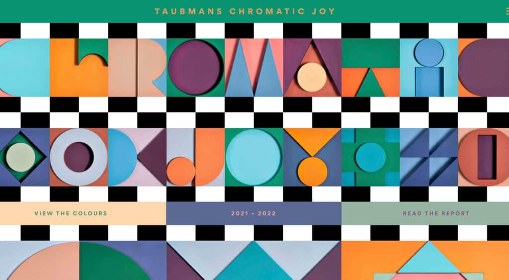
Taubmans Chromatic Joy
This micro-site promoting Taubmans’ new paint color collection is bursting with color and makes a big nod to the Memphis style of the 1980s.
Myriad
Myriad video production agency’s site uses small amounts of bright colors really well. And they quote Eleanor Shellstrop.
The Ocean Cleanup
Cleaning all the plastic crap out of the oceanic garbage patches is a grim job, but it’s getting done, and The Ocean Cleanup site explains how and why in a not grim way.
Photo Vogue Festival
This site displaying the work and talks from Vogue Italia’s 2020 Photo Festival mixes a hand-drawn style with clean type and a strong grid.
Zero
Zero is a digital branding agency. Their site is glossy with lots of high-quality images, smooth transitions, and a clear structure. The background options are a fun touch.
Fluff
This site for cosmetics brand Fluff takes an old school approach to designing for different viewports — sticking a fullscreen background behind your mobile view for desktop sounds like a terrible idea, but here it works.
Patricia Urquiola
The new site for Patricia Urquiola design studio is bright, bold, and assured, inspiring confidence.
Breathing Room
Breathing Room describes itself as a volunteer creative coalition that designs spaces for black people to live without limits through art, design, and activism. The design radiates confidence and optimism.
A Year in Review
A microsite from Milkshake Studio, highlighting their work over the past year. Some good scrolling animation.
Umamiland
Umamiland is an animated interactive introduction to Japanese food, with links to Google search results for individual items or where to get them.
Acqua Carloforte
Carloforte is the town on the island of San Pietro, near Sardinia, and the scents of the island inspire the perfumes of Acqua Carloforte. Cue beautiful photography.
Eugene Ling
Eugen Ling’s portfolio site is simple and straightforward with little or no marketing-speak and a lovely, understated slider transition.
CWC Tokyo
Cross World Connections is an Illustration and Creative Agency based in Japan and represents illustrators from all over the world.
Lions Good News
Following the cancellation of the Cannes Lions Festival of Creativity in 2020, this site was set up to highlight good news in creativity during the pandemic. A carousel of paper flyers forms the main navigation and creates a lo-fi, DIY feel.
G!theimagineers
G!theimagineers is a production studio for events and entertainment. White lines on black, horizontal concertina navigation, and lots of circles.
Sgrappa
Sgrappa is handmade grappa with attitude, and this site has an uncompromising, in your face vibe.
