In April’s edition, there’s a whole heap of large-scale, and even full-screen, video. Drone footage is back with a vengeance, as are videos seamlessly woven into a design. Enjoy!
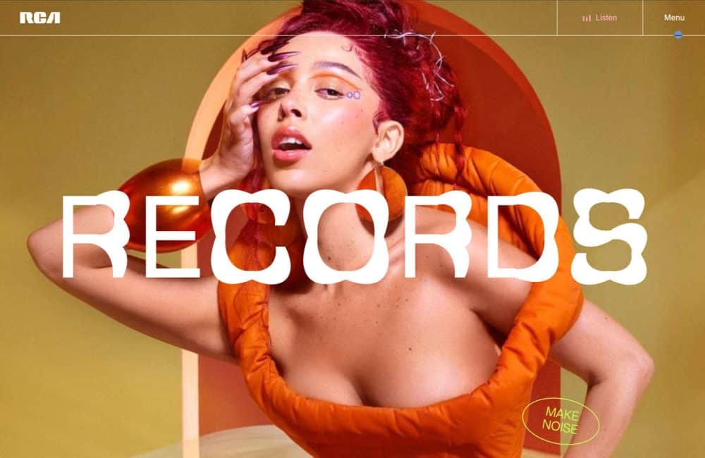
RCA Records
The new website for RCA Records takes a maximalist approach with exciting typography, fantastic imagery, and sound to showcase decades of incredible music artists.
Curious & Company
Curious & Company is a design agency that’s sure to know exactly what you and your clients want. Its site is packed with gloriously realized mystical imagery.
Memory
Memory is an AI tool for making smarter business decisions. Its site is open, clean, friendly, and with enough bold decisions to feel innovative and important.
Shinbu Dojo
Shinbu Dojo is a site for an Aikido club in Belgium. It uses a beautiful color scheme, animation, and video to draw you into this lovingly designed website.
SaaStock
SaaStock is a conference for founders, execs, and investors in Dublin, Ireland. Its bold colors, inventive typography, and energy-packed illustrations hit the perfect tone.
Jason Bailey Studio
Jason Bailey Studio is a photography and motion studio that specializes in alcoholic drinks brands. The full-screen hover effects are particularly effective.
365 – A Year of Cartier
365 – A Year of Cartier looks at the last 12 months of the jeweler’s business. It’s as glossy a magazine experience as you’d expect from this brand.
Aether Apparel
Aether Apparel uses a classic approach to convey its brand values. Off-grid adventures inspire us, and the clothing we need just happens to be right here.
Women of Vision Awards 2023
This horizontal scroller for Ms. Foundation’s Women and Vision Awards 2023 encapsulates the atmosphere of a black-tie event with white and gold on black colors.
West Block
West Block is an exciting renovation for businesses in Canberra, Australia. It’s an office environment nestled in a natural setting and looks like the perfect workplace.
Pudding Studio
Pudding Studio uses a brutalist approach, softened by some delightful animated illustrations. The case studies are well-detailed, and the site is fun without being silly.
Lozza Occhiali
Lozza Occhiali has been making eyewear since 1878, and its new website nods to both contemporary style and classic Italian heritage. It’s a great example of refined style.
The Office of Ordinary Things
The Office of Ordinary Things is a creative agency based in San Francisco. Its portfolio site is more like a reel, with tons of color, energy, and inspiration.
Rotolo’s Pizzeria
Rotolo’s Pizzeria takes a nice split-screen approach with subtle transitions to offer a Craft & Crust or Pizzeria experience. The correct answer is, of course, both.
Green Reconstruction of Ukraine
Green Reconstruction of Ukraine is a fascinating mini-site that chronicles the efforts to renovate a hospital near Kyiv’s heating and energy system using green approaches.
D.A.Consortium Recruit Site
The micro-site for D.A.Consortium’s entry-level and intern recruitment is bursting with positivity. It uses cute animated illustrations to enliven the page.
8px.studio
8px.studio uses a non-BS black-and-white theme to keep things simple. Creative but business-orientated, it’s a design studio for people who want to get things done.
Kora Living
Kora Living specializes in sustainable, flexible accommodation in Spain. Stay for a few days or a few months; it’s perfect for anyone who travels while working remotely.
Poggio al Tesoro
Poggio al Tesoro is a wine-maker with a typically Italian passion for nature, produce, and the landscape. Video, drone photos, and refined typography reinforce this high-end wine label.
Surya Aditya
Surya Aditya is an independent project manager and web developer specializing in JavaScript, Typescript, and WebGL. This portfolio is as slick as you would expect.
