Sometimes it’s easy to feel like the world is going to pieces all around us, especially when we’re doom scrolling Twitter between news alerts every few minutes. But if we step back a little, things may not seem so bad.
On the web, we see companies and individuals taking a positive stand, making changes, and carrying on despite challenging circumstances. So in this month’s collection, we celebrate confidence and accentuate the positive, as the song says. Enjoy!
Plastic Bionic
The ‘change view’ option is well used in this portfolio site for Plasticbionic design studio. The grid view is especially pleasing.
Fabricca
Creative agency Fabricca has gone for a simple look, with some appealing illustrations and custom icons.
Normand
The color scheme and display font choice (Knockout) make a strong statement here for law firm Normand.
Dumpling Delivery
We all need some bored-on-a-slow-friday-afternoon distraction from time to time, and Mailchimp delivers the goods here.
OTR
OTR is a mental health service for young people aged 11-25. The site does a great job of feeling approachable and friendly to younger users while not being condescending, cutesy, or childish.
neueMeta
Good use of block color adds extra depth to this otherwise brutalist portfolio site for neueMeta design studio.
Vitra Chair Finder
This interactive questionnaire helps the customer identify the best chair for their needs. The animation is done well here, and a page of swirling Vitra chairs is a lovely thing to see.
Chia Studios
A good balance here of serious and fun in Chia Studio’s portfolio site, professional but friendly.
Sagmeister 123
The concept behind this limited clothing range designed by Stefan Sagmeister is that, taking the long-term view, the world is actually getting better. As such, the Sagmeister 123 site has an overall feeling of quiet positivity. And a koala.
RecPak
RecPak is a meal replacement shake designed for taking during outdoor activities. The site has an active, dynamic feel that works well to convey a sense of rugged outdoor adventure.
Alicia Moore
This site for Alicia Moore clothing brand oozes style and sophistication with soft colors and beautiful fashion photography.
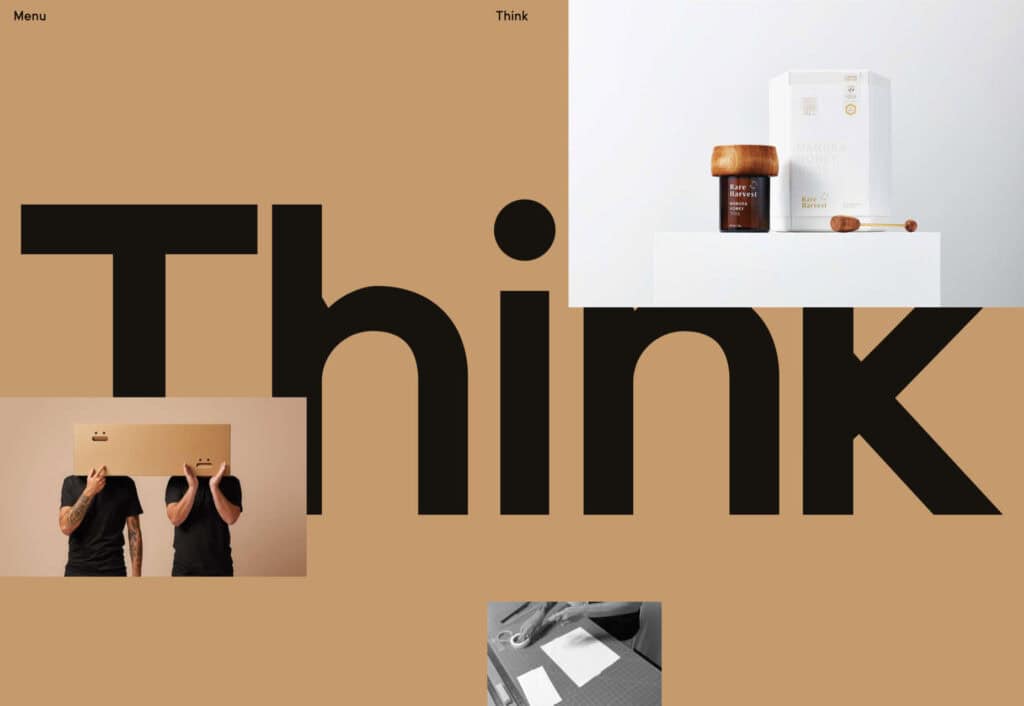
Think Packaging
Think Packaging’s website has a bright, bold, fun feel. Case studies are well presented visually but keep text to a minimum.
BP&O
Brand design and packaging blog BP&O has added extended content for subscribers, and their new site is a pleasure to browse.
The Future Factory
The Future Factory is a business lead generation agency, which doesn’t sound, well, a bit dull. But, some funky animation and slightly quirky type certainly do not convey dullness.
Polybion
Polybion’s new website has a spacious feel with a rich color scheme adding a sense of confidence and brand maturity.
The Empathy Experiment
The Empathy Experiment is an interactive ‘game’ from digital agency media.monks that examines empathy and inclusivity in the workplace while at the same time showcasing some technical skills.
Belle Epoque
The opening scroll on Belle Epoque’s site is really pleasing, and the random floating shapes are intriguing.
Richard Ekwonye
Richard Ekwonye’s portfolio site is clean and straightforward. Skills are on display, but without intruding on the content.
SND
SND has created UI sound kits. The site is as simple as it could possibly be, and yet it is impossible not to investigate all the sounds and start imagining where you could use them.
KMZ Industries
Regular readers will know how much we like technical/industrial-made-interesting sites, and this one for KMZ grain storage systems is a perfect example.
