We know from both our educations and our personal experiences that color has a huge impact on how a design or piece is perceived and received by those who cross its path. Across the Web we see the color spectrum being put to work in numerous ways. From large involved colorful creations, to the more sparse and minimal colorful inclusions, color gets used in some powerful ways in web design.
We went out on the Web and collected some fantastic examples from the lighter end of the spectrum for an inspirational showcase. Below you will find websites that successfully use a single color to highlight their designs. With their use of these chromatic accents throughout the websites, and the multiple shades of a single color, they have managed some breathtaking works that deserve a tip of the hat.
Jason Comes
Jason Comes uses subtle light green accents in a minimal grayscale design giving the site a feel of elegance and stability.
Cam
Cam uses a different monochromatic color scheme for each page, allowing the feel of the individual colors to come through while maintaining diversity throughout the site design.
Shibui
Shibui uses a pure black and white themed site for its clean, bold, mechanical look with just a hint of greyish blue to separate items.
ID Neon
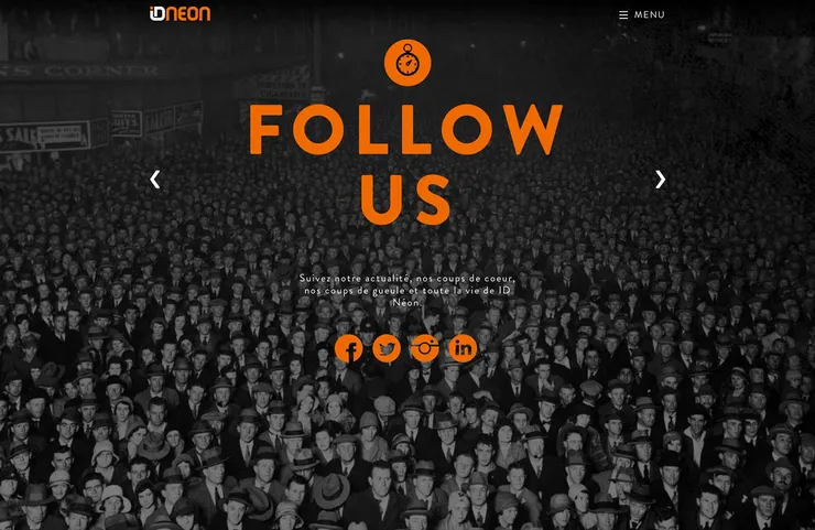
ID Neon keeps its background images black and white while keeping the content on top to a flat orange making the it all really stand out to the user.
Adria Verdaguer
Adria Verdaguer uses a clean flat design with blue green highlights that really pop and draw the eye to these highlighted elements on the page.
Crossroads
Crossroads uses orange accents on a dark background to give a feel of vibrant energy and athleticism with an edge.
Theme Squad
Theme Squad uses clean black type on a camo green background to show the military grade support for the themes they provide.
HAG
HAG uses the bright, energetic red that is the signature color of Switzerland perfectly to promote it’s Swiss made product line.
Studio Stylistik
Studio Stylistik uses a beautiful teal blue on a black background oddly enough to highlight their energetic style. Though blue tends to be more of a calming color, it really works here.
Neeeks
Neeeks uses large type on a grayscale photographic background with just a hint of color to pull your eye right to the call to action.
Nutone
The Nutone‘s gray on pink / pink on gray alternating theme not only looks great but keeps your attention on the content as you scroll through the site, alerting you to new sections as you come to them.
Play Dot To
Play Dot To uses a calming cool blue color scheme for an equally calming game of connect the dots that will take you right back to childhood.
Zample+me
Zample+me asks you a random yes or no question using a different monochromatic scheme for each page. Giving the design a clean look while maintaining variety.
Bespohk
Bespohk uses a bright blue consistently throughout the page, maintaining a calm and crisp tone throughout the site design.
3Coasts
3Coasts uses a full pallete of green shades to fill the site with a deep natural feel. The simple white on top of the green makes it really stand out and maintain high readability.
Moonshark
Moonshark uses a bright and bold blue in the website to offer potential clients and users alike a taste of the fresh, clean designs he creates.
Limoncello Studio
Limoncello Studio uses a lovely lime green accent on top of full grayscale illustrations offering a fun and whimsical personality to the site.
John Blek & The Rats
John Blek & The Rats uses a pallete of deep brownish oranges to pull off this fresh design mimicking the band’s earthy roots.
Fresh Ego Kid
Fresh Ego Kid uses vibrant hues of red to instil the viewer with the energetic wave of their sports apparel.
avantGrape
avantGRAPE uses the perfect juicy purple color scheme that fits the name of the site to a tee. As tantalizing to the eyes as to the tastebuds it teases.
End of the rainbow
That brings us to the end of this virtual spectrum of monochromatic web designs. We sincerely hope that you found some inspiration within the showcase examples we gathered together.
Which of these sites is your favorite? Have you designed a monochromatic site? Let us know in the comments.
