There loads of things that subconsciously sway our decision making everyday, subtle psychological influences working away in the background. Psychology affects your users’ experience. It has an unavoidable knock on effect on your conversion rates. It’s definitely time to upgrade your toolkit so you too can boost conversions on your landing page… Let’s go!
1. “Encapsulate” Key Areas of Your Page
Envelop and surround things you want to retain people’s attention, it stops attention wandering elsewhere on the page so quickly.
2. Exploit Color and Contrast
People emotionally react to color, so choose an appropriate palette. Use contrast to make your UVP and CTA’s jump off the page at the viewer. The “Von Restorff effect” says we remember stuff that sticks out, that is different so let’s use that to our advantage to ramp up conversion.
VWO uses color contrast to really draw your eye to the request a demo button.
3. Use White Space
Maximize usability by minimizing cognitive load. Whitespace isn’t just an aesthetic choice, it makes any user interface easier to digest. Use “whitespace to give visual breathing room” to important elements of your page.
4. Ensure Consistency
Earn the trust of your target audience. Give them the comfort they need, reassure them and allay any potential anxiety by providing a consistent user experience. Advertising, messaging, customer service (everything!) all needs to seamlessly come together to provide a united and trustworthy experience for highest conversion.
5. Connect with Pictures
We all recall images better than words. For a better user experience (and the conversion boost that comes with it!) incorporate relevant, emotive pictures into your landing page to give context and aid recall.
6. The Primacy Effect
…is the name given to the principle that describes people being more likely to remember things at the beginning of a list. There is a subconscious emphasis placed on things we hear or see first—capitalise on this and create killer headlines!
Duolingo’s page begins with a short, snappy, memorable headline.
7. The Recency Effect
Is another interesting aspect of how positioning of information on a page is crucial. People remember what came last in a sequence more easily too. Make sure you end a page on something you want to stick with your prospect like your USP.
Duolingo’s landing page finishes up with a concise call to action that echoes the headline.
8. Repetition, Repetition, Repetition
Ok so we remember the first and last things on a landing page more easily…but what about all that (quite frankly important!) stuff in the middle?! It’s a good idea to reiterate important information throughout a landing page to really drive home the message.
Repetition! Duolingo reinforces their messaging throughout their landing page.
9. Leverage Social Proof
People are complex social creatures, we all want to fit in. When we see other people doing something, our assumption is that that must be the right thing to do…so we want to do it too! Use strong, sincere testimonials (with images!) on your landing page to boost conversion.
10. Show Authority
Any well known brands or businesses use your product? Get some logos up on show to draw attention to how popular and credible your product is. People respect authority, use it to your advantage to encourage users to convert.
Trusted Housesitters leverage social proof using Trustpilot & demonstrate authority showing logos and awards.
11. Fear of Missing Out
People hate to miss out. They hate missing out far more than they like to gain stuff it turns out. Make it really clear to your potential users what they will lose out on if they don’t get on board. (Don’t be mean though—no one likes cold hard scare tactics!)
12. Show Urgency and Scarcity
Obvious as it seems, scarcity sells. Impose limited availability on your offering or a time limit on purchasing. Perhaps showcase the number of something sold or the decreasing number left available to convey real urgency and encourage conversions.
Amazon draws your attention with red text to highlight when there’s only a small number of something left in stock.
13. Inspire Reciprocity
Your user is far more likely to give of theirs in return for something of value. You want their details? Trade something for it and use it as an opportunity to exceed expectations.
14. Tell a Story
There is power in storytelling. Is a feature of every culture and people remember stories up to 22 times more than facts alone. Use the art of storytelling to engage prospects and trigger emotion. Great text and relevant images all help your message to resonate with your advantage and aid conversion.
15. Give something away for free
Everyone loves freebies! Giving away a sneak peek or trial of your product or service helps remove any anxiety about commitment to something users might not find they get on well with. Try before you buy type offers instil trust and provide good UX – win win!
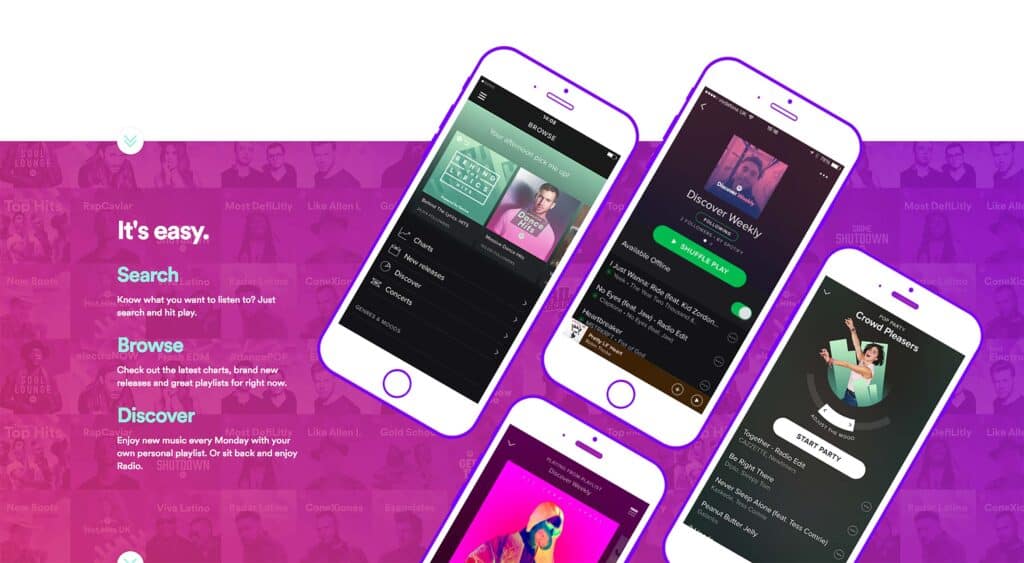
Spotify offers a free 30 day trial of it’s Premium Subscription to tempt you in.
Top performing landing pages apply combinations of the techniques described above to connect with their audience—no one aspect alone is the holy grail of conversion. Make it your mission to find what works well for your users and your product through ongoing testing and iteration—good luck!
