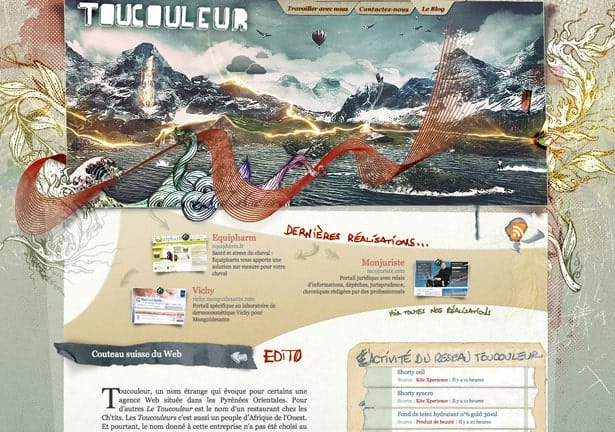
We live in a world of information saturation, and that translates to web design. In such a competitive world, it becomes more and more important to stand out by breaking conventions. Sometimes it’s about layout, sometimes about the graphics and cool illustrations or anything else that can be different from others.
In this post, we take a look at 100 websites that look really different from their peers and automatically captivate their audiences with their design of elaborate backgrounds, illustrations, and textures. Is different always good? Let’s take a look and decide by yourself…
Which ones are your favorites? Did we leave any good designs out? Please share with us!
