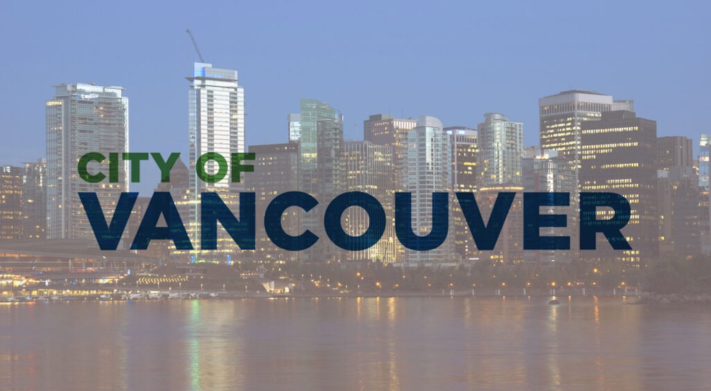
Many who don’t live in Vancouver at least know the western Canadian city for a few things: Sky-high housing prices, green sensibilities, and lots of rain. Now, thanks to local design and digital activists, they also know Vancouver for…producing a new city logo that has been blasted for being uninspiring.
In an open letter published on Medium, local Vancouver art director, Brock Ellis, lambasted Robertson’s and the City Council’s approval of the new logo as “disappointing” and something that doesn’t allow Vancouverites to express pride in their city. At the same time, the new design has been eviscerated on social media, creating a two-for-one punch that has forced the mayor into retreat.
Robertson has put the new logo on ice, directing city officials not to plaster it all over city assets, as was the original plan. Robertson, under fire for going the cheap route by only spending $8000 CAD to commission the redesign, is at least listening to designer and public backlash from this botched logo rollout.
When one compares the old city logo—a combination mark that included a wordmark with thinner fonts together with a flower—to the new one, it’s quite obvious to see what went so wrong.
Above: the original Vancouver logo. Below: the revised wordmark.
The new logo has been simplified, perhaps over-simplified, by moving exclusively to a workmark; the choice of Gotham block letter font has been the main target of the criticism.
The use of such a heavy, corporate font is viewed by the detractors as not in keeping with the city’s modern, more liberal sensibilities. In addition, Gotham is rather ubiquitous and so isn’t a sound choice for a city trying to position itself as unique. In other words, the font is simply too commonplace for it to be useful or meaningful in city branding.
While the redesigned logo sports blue and green—perhaps to symbolize rain and the city’s green sensibilities—it has prompted some to write it off as an alternate version of the Vancouver Canuck’s colors (blue and green feature prominently on the team’s uniforms).
The mayor has claimed that one of the reasons the unpopular logo was approved was to help those in Vancouver who don’t speak English as a first language to better understand the new logo. That begs the question, of course, as to why the city went ahead and still chose English words in the wordmark instead of going with a purely iconic or symbolic logo. Vancouver is, after all, home to many immigrants whose first language is something other than English.
Overall, this row over the botched redesign illustrates the pitfalls of going with the lowest bidder for something as important as a city’s logo, which ties into the even more important aspect of branding. Further, the failure of the mayor and the city council to also engage with and take feedback from the local design community during the logo redesign is another huge factor in this brouhaha.
