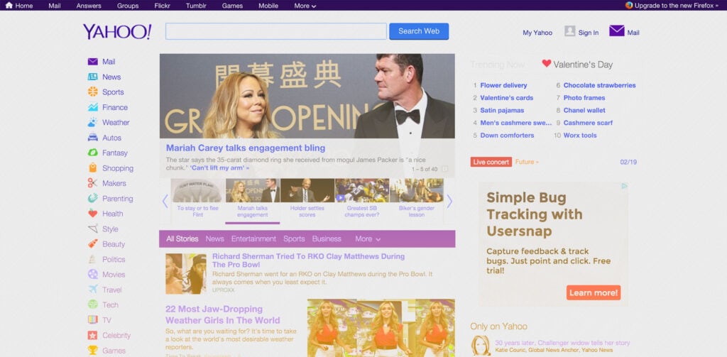
Yahoo is currently rolling out updates to its homepage and mobile app. The new design is being launched in the US, with other territories expected to follow shortly.
The new experience, which visually is an incremental evolution of the last few designs Yahoo has employed, is built around a news feed concept. The feed uses a variation on the infinite scroll, delivering a far more immersive user experience than previous iterations have managed. Hand picked stories by Yahoo’s editorial team feature at the top of the feed, ensuring that the premium content gets an airing. Alongside the curated stories are personalized suggestions for each visitor. The new site also prominently features breaking news stories; you’ll be able to track breaking news as it happens, and Yahoo will even push notifications to you as stories you’re interested in are updated with fresh details.
Yahoo’s business problems are well documented, and it desperately needs to foster some brand loyalty, while also boosting its revenue stream. The personalized news feed is central to its strategy for achieving this. As you use Yahoo, your preferences and interests will be recorded and used to deliver more content that Yahoo’s AI thinks you’ll like. The more time you invest with Yahoo, the better your feed will be; in theory, eventually resulting in a feed that’s all killer and no filler.
Yahoo’s new news feed
Having identified session abandonment as one of its key problems—SVP Simon Khalaf cites the case of users opening stories in tabs, which are all too easy to close—Yahoo hopes that a seamless browsing experience will deliver greater visitor retention, translating into longer sessions, and result in higher advertising revenue.
To the same end, Yahoo is bucking the industry trend by closely integrating user comments with its news feed. As most of the news industry moves away from comments onto social media, Yahoo is aiming to harness its community to engage users who previously only dropped in for a quick visit. It’s one of the riskiest aspects of the new design, because news sites worldwide are plagued by trolls in comment sections, and it only takes a few bad apples to make a comments section an unpleasant place to spend time. Unless Yahoo’s feed is diligently moderated it’s an approach that may well backfire.
Yahoo’s new community engagement
Yahoo has never had a problem attracting visitors, it’s a household name around the globe; its problems stem from an inability to retain visitors once they hit the site. The hope is that the dual strategy of a seamless, personalized news feed, coupled with community engagement will be the formula Yahoo needs to carve out a new niche for itself.
