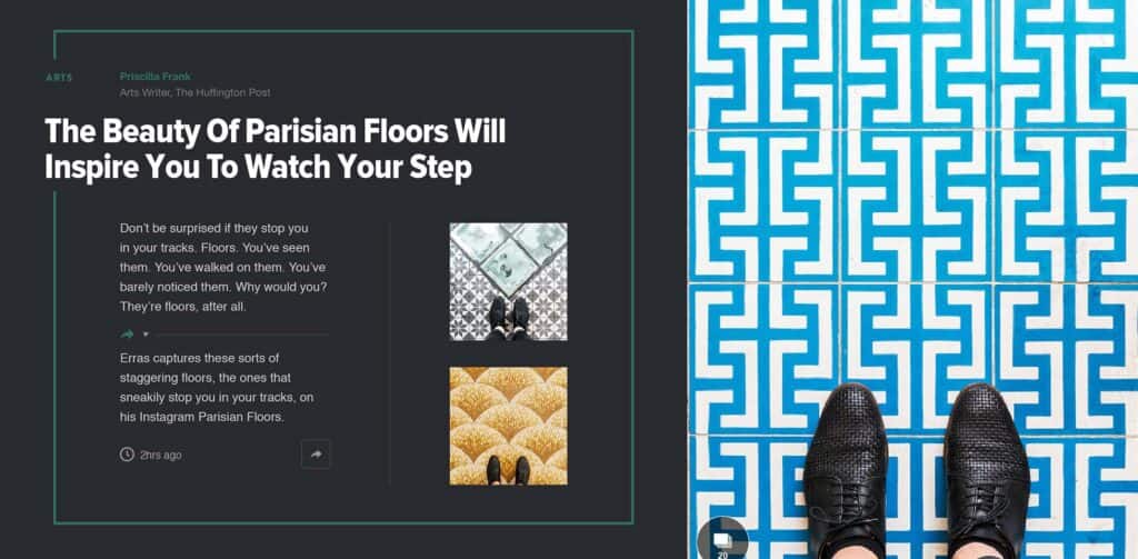
The Huffington Post used yesterday’s Advertising Week event in New York to announce the first major redesign in its ten year history.
The new design was produced in collaboration with design company Code and Theory, whose previous projects include designs for Bloomberg, the L.A. Times, and Mashable.
The site is a global leader in news, with over 214 million uniques per month, over half of which are from mobile devices. As a result, The Huffington Post, together with Code and Theory, have taken a strident view of mobile-first; the mobile site, featuring many of the new design features and functionality, was launched back in May; the desktop site will not go live until 2016.
The bold new direction for the site, manages to retain the core elements on which the brand is based. The trademark green, the familiar masthead, and the basic typography have been retained. The new design features longer page scrolls, thanks to a reduced number of columns and substantially more images.
As well as a front-end redesign, the company has taken the opportunity to revise its backend. Employing IBM’s Watson, to supplement its own analytics and research.
The feel of the site as a whole remains intact, but the new design is much stronger. It’s like the geeky kid who hit the gym over the Summer and came back to school leaner, fitter, and a lot more confident.
The Huffington Post aims to be a forward-thinking platform for information, discussion and engagement with the aim of inspiring and empowering our community…Our design reinvention, a collaboration with Code and Theory, will help further accomplish this important goal. — Jared Grusd, CEO of The Huffington Post.
