Beautiful visual design isn’t enough any more, modern design needs great interaction to really stand out. Animations in your designs can provide clarity, direct attention, and create a delightful experience.
Designing interactions is exciting, but costly. Often it takes back and forth between designers and developers to get animations just right; but it doesn’t need to be this way.
CSS transitions afford the opportunity for designers with limited knowledge of code to enhance their projects with stunning motion effects that will engage users like never before.
Let’s start with something simple: moving from one screen to another…
Simple view-slider technique
You can build with a text editor and a browser to test, but I prefer to use a tool like jsfiddle or codepen.
Build a basic layout something like this:
<div class="screen">
 <div class="slider">
 <img alt="" src="img1.png" />
 <img alt="" src="img2.png" />
 </div>
</div>
You’ll need a ‘screen’ and then a ‘slider’ inside the screen. The slider extends beyond the edge of the screen, and holds the mockup images.
To achieve this, you need to ensure that you add overflow:hidden to the .screen div.
Your CSS will look something like this:
.screen {
 overflow:hidden;
 width:320px;
 height:568px;
}
.slider {
 position:relative;
 float:left;
 height:568px;
 width:700px;
 left:0;
 -webkit-transition:all 0.5s ease-in-out;
}
.slider img {
 position:relative;
 float:left;
 height:568px;
 width:320px;
}
.screen:hover .slider {
 left:-320px;
}
The final statement in the CSS is what controls the position of the slider, it moves the .slider div left by 320px revealing the second image.
Here’s the jsfiddle with all the code.
With a bit of creativity, you can really run with this simple technique and create some clever animations. Things really start to get interesting when you combine effects. For example: I recreated Twitter’s ‘swipe-to-reveal profile’ from their mobile app using a very similar ‘slider’ approach.
3D transforms
Brush up on your 3d Transforms if you need to, because they provide a stunning visual effect.
Using the -webkit-transform: property, we can treat the browser as a 3D space and make some animations with depth. iOS7 in particular makes use of the ‘single space’ metaphor in its native apps. Also 3D transforms are very useful for creating ‘bouncing’ or ‘popping’ animations.
I used the same :hover tactic from our previous example and added some 3D transforms to create this effect:
Using jQuery and JavaScript
So far we’ve only looked at CSS :hover effects to produce animations. With jQuery, we can use click() events to designate addClass() and removeClass() on elements. This gives us a huge amount of flexability to do whatever kind of crazy animations we want.
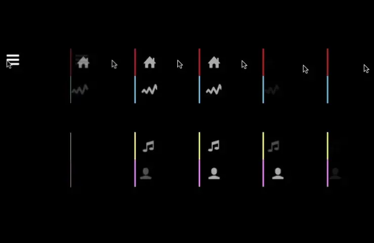
Below I have a function called kaskade, which applies the open class to each of 4 menu items in 0.15s intervals. The open class gives the icons opacity:1; and left:0; when before they were at opacity:0; and left:-50px. This creates a playful opening effect for the menu. Experiment for yourself inside the jsfiddle.
This last one is a rather extreme example, but it just goes to show what’s possible with this system of prototyping:
Once more, here’s the jsfiddle.
By designing your own simple animations, you’ll save yourself and your development team a lot of time and energy. With CSS you can experiment with animations and send your engineers living, breathing, moving examples. All it takes to bring your mockups to life is a little bit of code.
