Cutting a path through the clouds, heading to some far-flung destination; or working through the night to connect national and international business; the way we perceive airlines has barely changed in the past 50 years.
And that perception — one of glamour, efficiency, and professionalism — is almost entirely due to clever advertising and careful branding. The actual experience of travelling by air is, in reality, one of queues, delays, lost baggage, high-cost and ever decreasing leg room. But we forget all that when we see the proud colors of our nations’ flags emblazoned across the tail of an aircraft. As the reaction to American Airlines’ rebranding proves, we expect a certain heritage to be present in our airline branding.
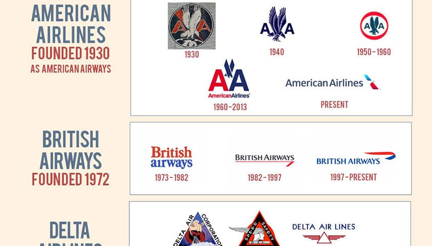
As this infographic shows, national identity, speed and history, coupled with the tail fin of a plane all combine to keep us flying.
Produced by JustTheFlight.co.uk
Who did you last fly with? Do you recognize their branding in any of the trends shown here? Let us know in the comments.
