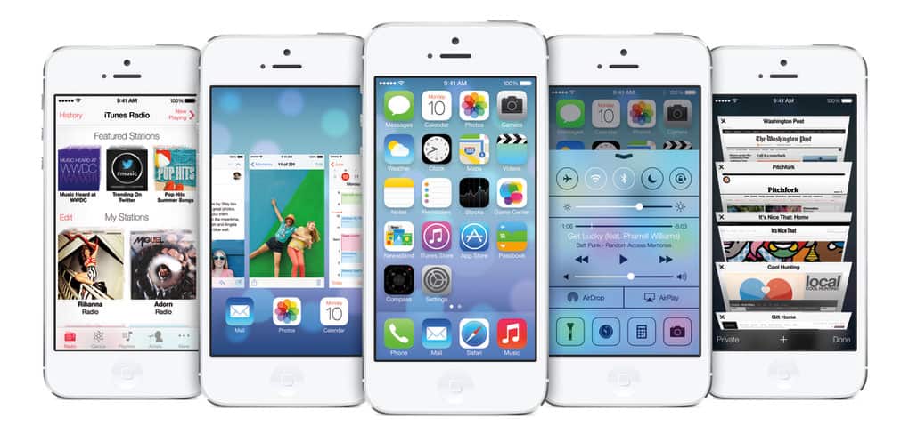
As expected, Apple used today’s keynote presentation at their WWDC (Worldwide Developers Conference) to launch the latest version of their mobile operating system: iOS7.
The launch has been greatly anticipated, not least because iOS7 has been completely overhauled by Apple’s design guru Jonathan Ive. Ive’s involvement with Apple has, until now been restricted to hardware design and he is responsible for some of the company’s most iconic output, including the iPod, iMac and of course, iPhone/iPad ranges.
The keynote began with introductions to new Apple products, including a new version of MacOS and the astoundingly Vader-esk Mac Pro, that will launch later this year. But it was clear from the reaction of the crowd in the auditorium that it was the announcement of iOS7 that had been most anticipated.
There had been much debate as to whether or not Ive would adopt a flat design approach, and it was clear immediately that although iOS7 is substantially more minimal than its predecessors, he hadn’t done so:
The first thing you encounter in iOS7 is is the new unlock screen. Conceptually the same as all previous iterations, it is sleek and minimal. The new font — which seems to be a variation on Helvetica Thin — is evident immediately. The round buttons that replace the old input keys were widely anticipated and are evidence that many of the changes had been expected.
The second thing you’ll encounter is the parallax home screen. By tilting your phone, the wallpaper on the screen will move slightly, the icons appearing to float above it. It’s a fun party trick, but feels a little gimmicky.
Ive’s output for Apple has predominantly been black, white and polished metal. However, the first generation of iMacs hinted at his color tastes and the current range of iPod Nanos are similarly bright. Looking at iOS7 it’s clear to see why Apple have steered him towards the mono-tonal palette we’re used to: the washed-out neons that adorn the new iOS7 have none of the sophistication of Android or even Blackberry and surely have more to do with the fashion tastes of an aging hipster than a young design maverick.
The consistency of icon design that we were promised is notably absent, and don’t look like a fully resolved design.
Where Ive’s design is successful is in making the interface unobtrusive, and during the keynote he spoke on video about the “profound and enduring beauty [he finds] in simplicity”. The UI is substantially reduced: the dominant black of the current iOS being replaced with a dominant white; bevels have been removed; and buttons themselves now resemble the ‘active areas of screen’ that they are, rather than actual buttons.
Something that iOS users will like less than Android or Windows users is the adoption of a ‘control center’ which seems to muddy the water of an otherwise brilliantly simple OS. The control center’s pull-up tab contains ‘essential’ functions and features, and is otherwise much like the pull-down info in the current iOS.
A huge criticism of iOS in the past has been the inability to multi-task, but having solved the battery issues iOS7 will enable multi-tasking for all apps instead of a select few.
One fact that was slipped in, almost casually, was that rather than offer the option to search the web (using Google) as is now the case, in iOS7 Siri’s search will be directly integrated with Bing. Whether this is a result of the cooling relations between Apple and Google, or whether Bing genuinely offers a better product is hard to judge. What is certain is that Bing rankings will now be far more significant for clients and future SEO will need to focus on more than Google page rank.
Safari has also been revamped: it has an all-new look to match the other native apps; much of the clutter has been removed to allow your eye to focus on page content. The biggest change being the new tabs view which is an updated version of Apple’s coverflow — expect to see this copied everywhere starting now.
The most pleasing changes are the ones heralded with least fanfare, especially the typography, which has been completely overhauled to create a more spacious and consistent feel across the device.
Apple began their presentation focusing on iOS’ market dominance and customer satisfaction. Undoubtedly they’ll hope that iOS7 will arrest their slipping market share and ensure a healthy future for their device range, they’ll have to wait until Fall to find out.
What do you think of the design of iOS7? Is it an improvement? What’s missing that you hoped to see? Let us know in the comments.
