While typography is typically a two-dimensional proposition, the communication design students at the University of Applied Science in Dusseldorf have expanded the practice to 3-D.
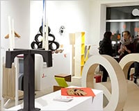
As an exercise in three-dimensional letterforms and their applications, the school’s budding designers crafted typographic furniture for each letter of the alphabet.
The goal was clear: seek to combine artistic expression and readability with functionality. It turns out that a lowercase “G” makes an ideal bench; “T” lends itself to a chic table; and the letter “Q” makes for a striking clock.
Perhaps the most elegant interpretation is the ‘P’ for ‘paper’.
The innovative approach by the course is an excellent example of what we can learn when we look at forms from a different perspective, and further advances the cause — if any further argument were needed — of cross-discipline design education.
No doubt this kind of ingenuity will put these creative students at the head of the class. The only question now is whether they’ll turn out to be designers of the graphic — or industrial — variety.
Which piece of letter furniture do you like best? What other forms do letters lend themselves to? Let us know what you think in the comments.
Stacey Kole
Read Next
Inspiration in Every Hue: Discover Color Palette
Color Palette is a web application developed by Tobias Mønster Madsen, designed to provide users with a collection of curated color palettes for inspiration and design purposes. Currently, the site…
3 Essential Design Trends, November 2024
It’s hard to believe the end of the year is right around the corner. That isn’t stopping website designers from trying new things to keep things interesting as we begin…
3 Essential Design Trends, October 2024
This article is brought to you by Constantino, a renowned company offering premium and affordable website design You have to get creative when you lack a strong visual. This month’s design…
3 Essential Design Trends, September 2024
September’s web design trends have a fun, fall feeling … and we love it. See what’s trending in website design this month. Excuse the pun, but let’s fall into some…
Turning Rejection into Fuel: Your Guide to Creative Resilience
Rejection sucks. And for some reason, it’s always unexpected, which makes it feel like an ambush. Being creative is about making yourself vulnerable, and that’s why rejection hurts so much….
3 Essential Design Trends, May 2024
Integrated navigation elements, interactive typography, and digital overprints are three website design trends making waves this month. Let’s take a look at each design trend with some fun examples. If…