

Website Notifications
The COVID-19 world health pandemic has created a need for many designers to add notices to websites. From temporary closures to delayed shipping to changes in business operations, almost every transactional website has a need for a notification. And while many of us are having to react fast, there’s no reason these notifications need to look bad. The keys are to ensure simplicity, readability, and user-friendliness. Each of these three website examples does it in a different way, but all meet the three goals above. One big change to these pop-ups from others that we’ve looked at recently is the mood of the design. It is somber and informative, not bright and cheery like many of the more sales-oriented pop-ups that have been popular. Dick’s Sporting Goods uses a simple popup with a store image in the background that’s faded out with bold white text on top. The message is direct and to the point. There’s a secondary popup notice at the bottom of the screen for users who want to know more.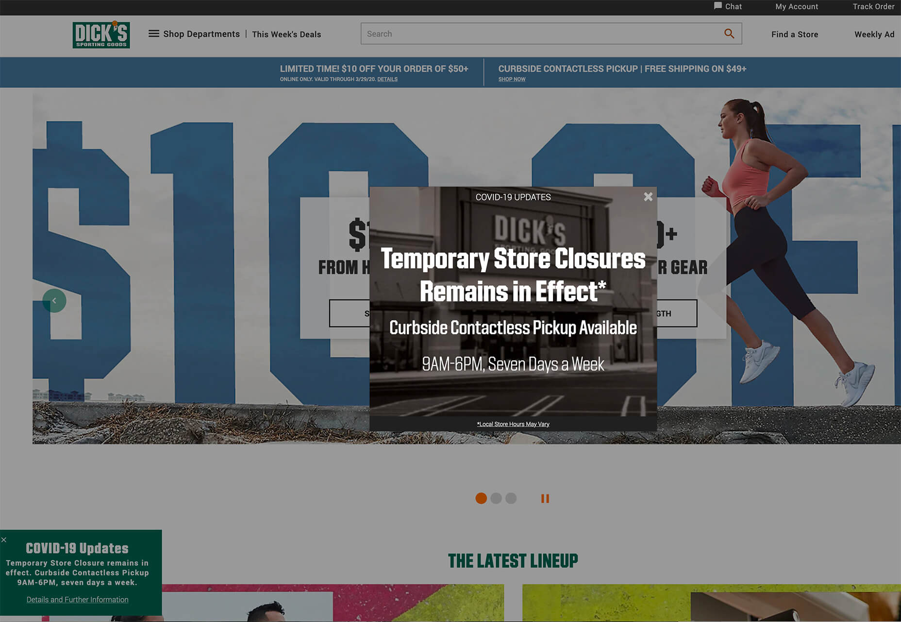 The pop-up notification has an obvious X to close the window. When the primary, center screen pop-up is displayed the rest of the website has a dark overlay to help bring focus to the notification.
Chase retooled their website header, stripping out images, to include a COVID-19 update notice alongside the customer login box. Information is easy to read and the red icon distinguishes this as important information. The button is large and visible, making it easy to find more information about what the financial institution is doing and how to find help if you need it.
The pop-up notification has an obvious X to close the window. When the primary, center screen pop-up is displayed the rest of the website has a dark overlay to help bring focus to the notification.
Chase retooled their website header, stripping out images, to include a COVID-19 update notice alongside the customer login box. Information is easy to read and the red icon distinguishes this as important information. The button is large and visible, making it easy to find more information about what the financial institution is doing and how to find help if you need it.
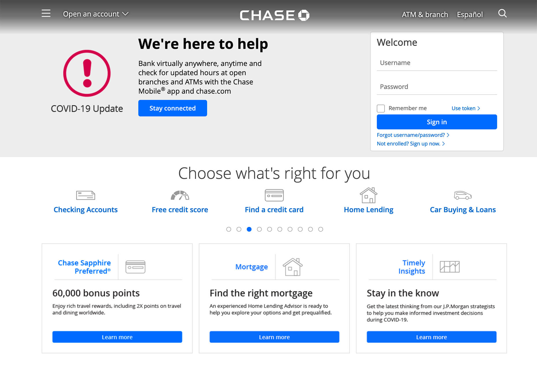 The shift from an image header to this informational one changes the whole mood of the website to one that is appropriate for the times.
Hell’s Kitchen uses a simple pop-up with a full-screen overlay that darkens the rest of the design. This pop-up notification contains a lot of information. But blocks of text and bolding in the right places keep it organized. The date as a headline also helps customers know that the information is up-to-date with fast-moving changes that are happening everywhere.
The shift from an image header to this informational one changes the whole mood of the website to one that is appropriate for the times.
Hell’s Kitchen uses a simple pop-up with a full-screen overlay that darkens the rest of the design. This pop-up notification contains a lot of information. But blocks of text and bolding in the right places keep it organized. The date as a headline also helps customers know that the information is up-to-date with fast-moving changes that are happening everywhere.
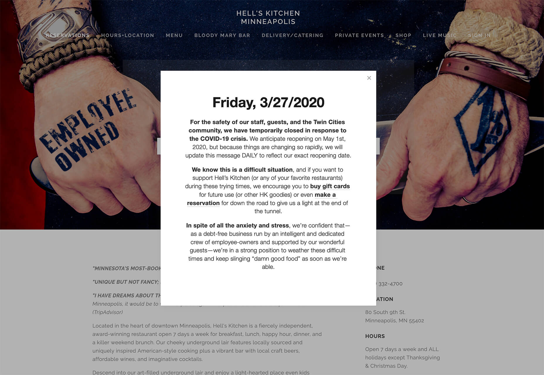 Note that the notification also includes links to other parts of the business that can be patronized, such as buying gift cards or making a reservation in the future. Adding a relevant link or button to a notification is a good way to help users do something with the website when they can’t necessarily do what they originally came for.
When creating this style of notification for your website, pay attention to relevant settings. With sales-based notifications or pop-ups, they may time out, stop displaying due to a cookie, or only appear for certain customers or on certain pages.
With a notification such as the ones we are seeing for COVID-19, it is likely that you’ll want to think about these settings carefully. You will likely want a popup to appear on every visit for every customer. You may need a couple of notification types; one for a physical closure and another to note delayed shipping times, for example.
Note that the notification also includes links to other parts of the business that can be patronized, such as buying gift cards or making a reservation in the future. Adding a relevant link or button to a notification is a good way to help users do something with the website when they can’t necessarily do what they originally came for.
When creating this style of notification for your website, pay attention to relevant settings. With sales-based notifications or pop-ups, they may time out, stop displaying due to a cookie, or only appear for certain customers or on certain pages.
With a notification such as the ones we are seeing for COVID-19, it is likely that you’ll want to think about these settings carefully. You will likely want a popup to appear on every visit for every customer. You may need a couple of notification types; one for a physical closure and another to note delayed shipping times, for example.
Retro Typography
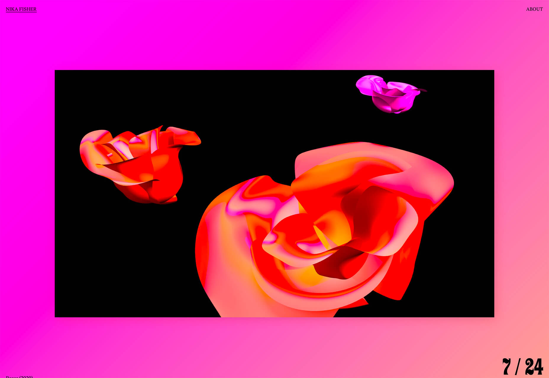
Old styles almost always come back around. Designers seem to be experimenting with retro typography styles in a big way lately, making this a website design trend this month. Retro styles are being used in a variety of ways and there isn’t one dominant typography style. The most common theme seems to be retro typefaces that are a little flowier with a lot of character and personality. Retro typography styles are nice because they can create a very intentional mood for a project. One of the concepts that has trended in 2020 is the notion of throwing back to the 1920s. That retro style is something you can see hints of in the typography choice for Playful. Without saying anything more, a typeface can transport someone to a different era or mood. That’s exactly what this design trend does for these projects. Playful uses Antiga Regular for the main headlines.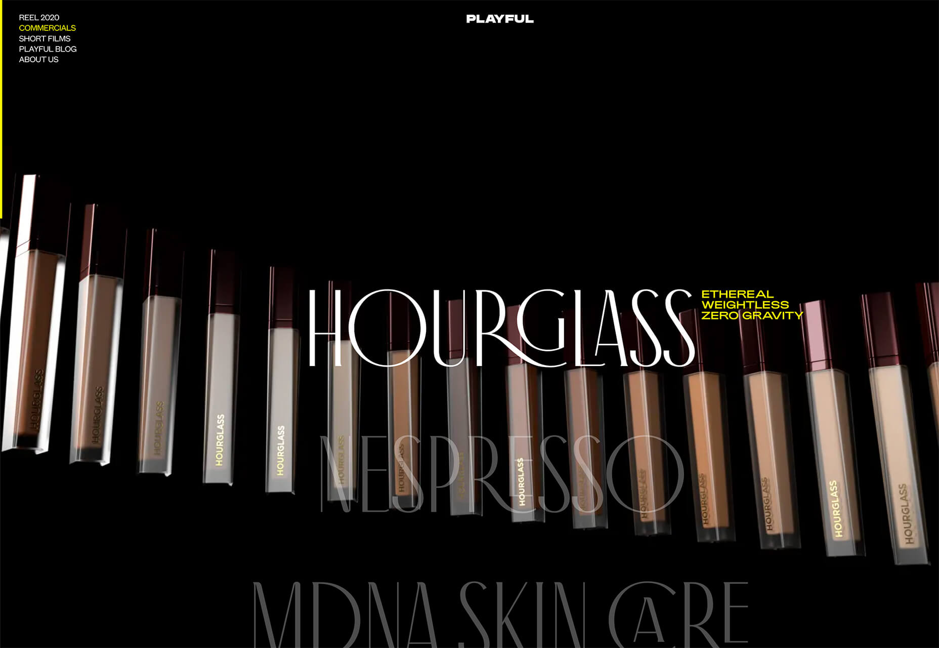 Nika Fisher uses Ziggy for the nifty counter in the bottom right corner.
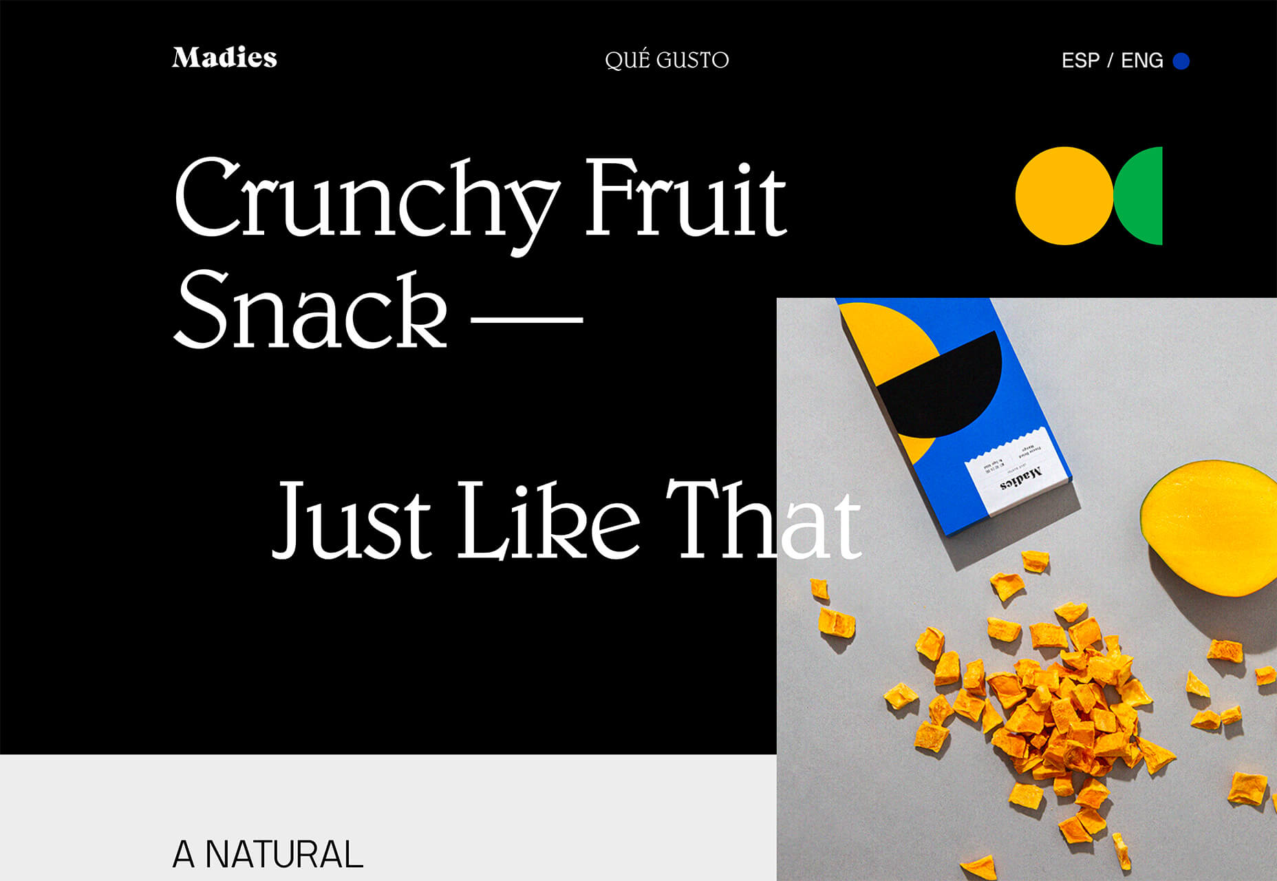
 Madies uses Blw for the main headlines. (Note that the logo also uses a different retro style as well.
Blue and Green Color Schemes
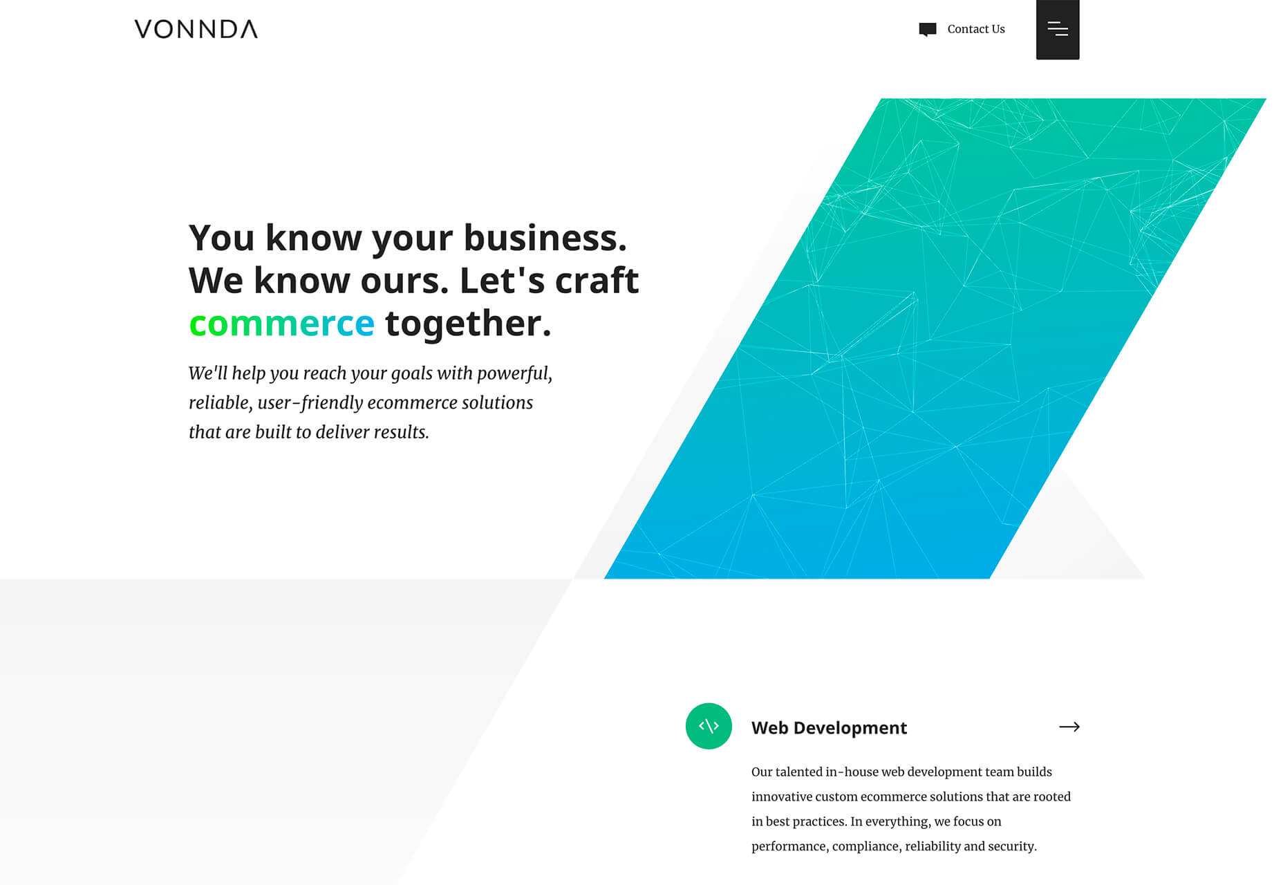
Blue and green color schemes make you think of nature: Green grass and trees and blue sky. These palettes can be calming, soothing, and very harmonious. (All things that might be a fresh feel in a tumultuous world, right now.) While the use of blues and greens is not new, it is a combination that we haven’t seen a lot of in website design projects for some time. These color schemes are evolving in a few different ways and are an easy fit with many brand colors and styles (thanks to a mostly neutral feel). If you are interested in using this trend, play with different shades of blue and green. Start with a blue or green that is part of your brand color palette (if you have one), and incorporate colors around it. Another option is to work from a blue or green that you might have used as part of another color trend, such as the super bright colors from GadgetGone. The blues and greens here have a definite Material Design vibe to them.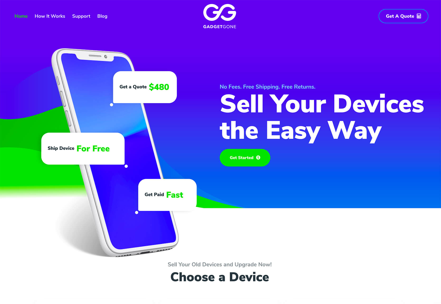 Vonnda mixes the gradient trend with green and blue to create a striking visual on its homepage. The color combo makes a cool gradient in the oversized geo shape on the right side of the screen (which has a nice balance with all the whitespace) and helps the eye move through the text thanks to “commerce” highlighted using the same green-blue gradient.
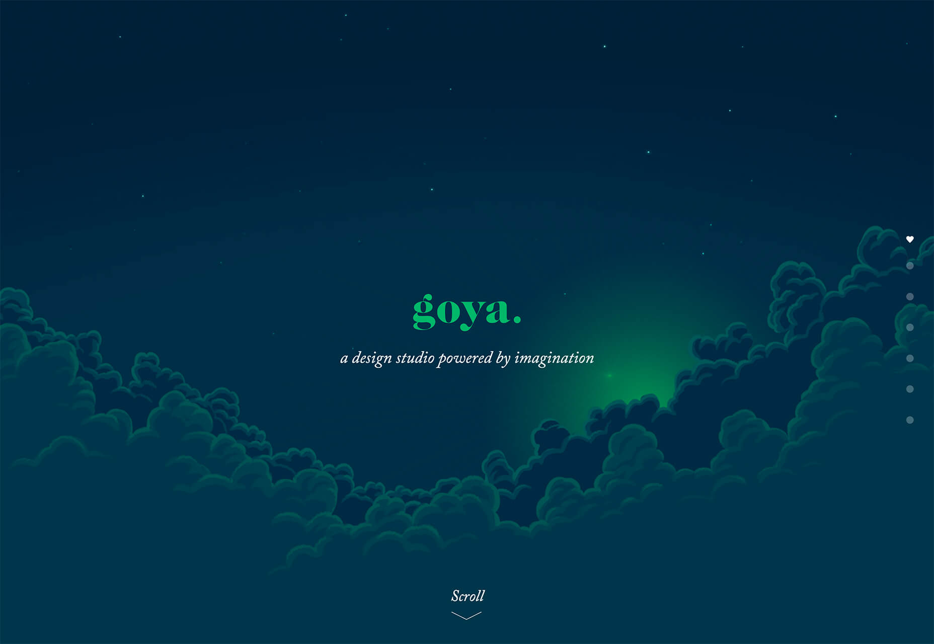
 Goya uses a deep navy background with a striking emerald green to create a simple homepage aesthetic. Green is used as a highlight color in the downpage illustration and is the brand color that serves as a thread between scrolls in the one-page design. This example shows how to start with a brand color (emerald) and build a trendy palette around it.
Conclusion
While this month’s design trends might be a little more somber than in recent months, it is a reflection of world events. Even in uncertain times, design work continues and new trends will emerge.Carrie Cousins
Carrie Cousins is a freelance writer with more than 10 years of experience in the communications industry, including writing for print and online publications, and design and editing. You can connect with Carrie on Twitter @carriecousins.


Read Next

20 Best New Websites, April 2024
Welcome to our sites of the month for April. With some websites, the details make all the difference, while in others,…

Exciting New Tools for Designers, April 2024
Welcome to our April tools collection. There are no practical jokes here, just practical gadgets, services, and apps to…

14 Top UX Tools for Designers in 2024
User Experience (UX) is one of the most important fields of design, so it should come as no surprise that there are a…
By Simon Sterne

What Negative Effects Does a Bad Website Design Have On My Business?
Consumer expectations for a responsive, immersive, and visually appealing website experience have never been higher. In…

10+ Best Resources & Tools for Web Designers (2024 update)
Is searching for the best web design tools to suit your needs akin to having a recurring bad dream? Does each…
By WDD Staff

3 Essential Design Trends, April 2024
Ready to jump into some amazing new design ideas for Spring? Our roundup has everything from UX to color trends…

How to Plan Your First Successful Website
Planning a new website can be exciting and — if you’re anything like me — a little daunting. Whether you’re an…
By Simon Sterne

15 Best New Fonts, March 2024
Welcome to March’s edition of our roundup of the best new fonts for designers. This month’s compilation includes…
By Ben Moss

LimeWire Developer APIs Herald a New Era of AI Integration
Generative AI is a fascinating technology. Far from the design killer some people feared, it is an empowering and…
By WDD Staff

20 Best New Websites, March 2024
Welcome to our pick of sites for March. This month’s collection tends towards the simple and clean, which goes to show…

Exciting New Tools for Designers, March 2024
The fast-paced world of design never stops turning, and staying ahead of the curve is essential for creatives. As…

Web Tech Trends to Watch in 2024 and Beyond
It hardly seems possible given the radical transformations we’ve seen over the last few decades, but the web design…
By Louise North